[New material has been added to this post]
[More new material added – monthly SBRE calculation 4/11/14]
Just in case you were not aware, since about 1997 or so, there has been nearly no global temperature rise. This is despite atmospheric CO2 concentration continuing to rise. To date there are some 55 ideas to explain this slowdown in global warming. Some of the ‘explanations’ presume the so-called ‘greenhouse effect’ is operating as the IPCC models calculated; it’s just that the heat has hidden elsewhere, maybe deep in the ocean.
I wondered if there was empirical data available of the greenhouse effect? And could it show whether or not the greenhouse effect is increasing with increasing CO2, as the IPCC models expect?
First a very quick summary of the IPCC’s greenhouse theory goes something like this. Increasing CO2 absorbs some of the upwards radiation from the surface, and then re-emits it back toward earth. This has the effect of increasing earth’s atmospheric temperature as outgoing longwave infrared radiation (OLWIR) is reduced by increasing quantities of CO2. Then, recognising that water vapour is the main greenhouse gas, the IPCC models propose that positive feedbacks dominate. This is where some warming leads to increased water vapour, and as water vapour is the main greenhouse gas this increases the greenhouse effect, this further lowers OLWIR, and increases the temperature.
So let’s see how the measurements fit the theory. I needed two data sets, one for OLWIR, and the other global temperature.
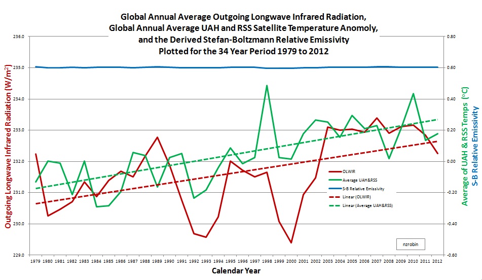
I emailed the National Oceanographic and Atmospheric Administration (NOAA) asking for website directions to their OLWIR data. Their response was quick and I downloaded monthly average OLWIR (W/m2) for each 2.5 degree latitude by 2.5 degree longitude area of the globe. After converting the netCDF files to Excel, I scaled each area’s OLWIR to account for the varying size of the area, resulting in a global average OLWIR. (I used Cosine(Latitude) to approximate the relative areas). (There was also some missing data mid 1994 to early 95. I populated this by a linear interpolation). The resulting annual average OLWIR is shown in the graph below for the years 1979 to 2012. A linear regression fit shows a generally increasing trend in OLWIR over this period.
The temperature data I chose is the average of both University of Alabama Huntsville (UAH) and Remote Sensing Systems (RSS). The result is also plotted on the graph below. A linear regression fit shows a generally increasing trend for years 1979 to 2012. 2013.
And now we’ll take a look at the Stefan-Boltzmann (SB) relative emissivity trend. Using an average global temperature of 14C, the SB relative emissivity has been derived using E/(K*T^4) for each year and plotted on the graph. If the greenhouse effect was increasing, the relative SB should be declining. It’s not. It’s flat lining.
The two primary results of this empirical study are:
The missing heat has gone back to space as it always has – as per SB law, via OLWIR.
And more importantly, the greenhouse effect is not increasing as per IPCC dogma.
There are probably about 55 reasons why … and there’s likely more to be said …
 [Additional Material]
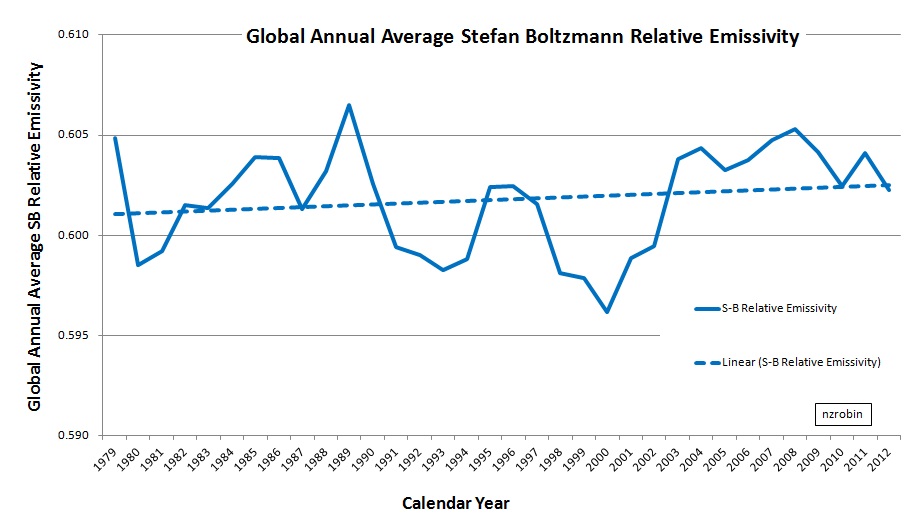
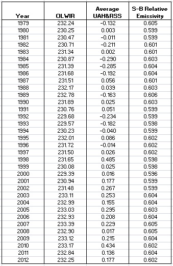
Richard C in his comment below suggested the addition of a graph of the derived relative emissivity at a closer scale. I have added the graph below along with the complete data table used to produce both graphs.
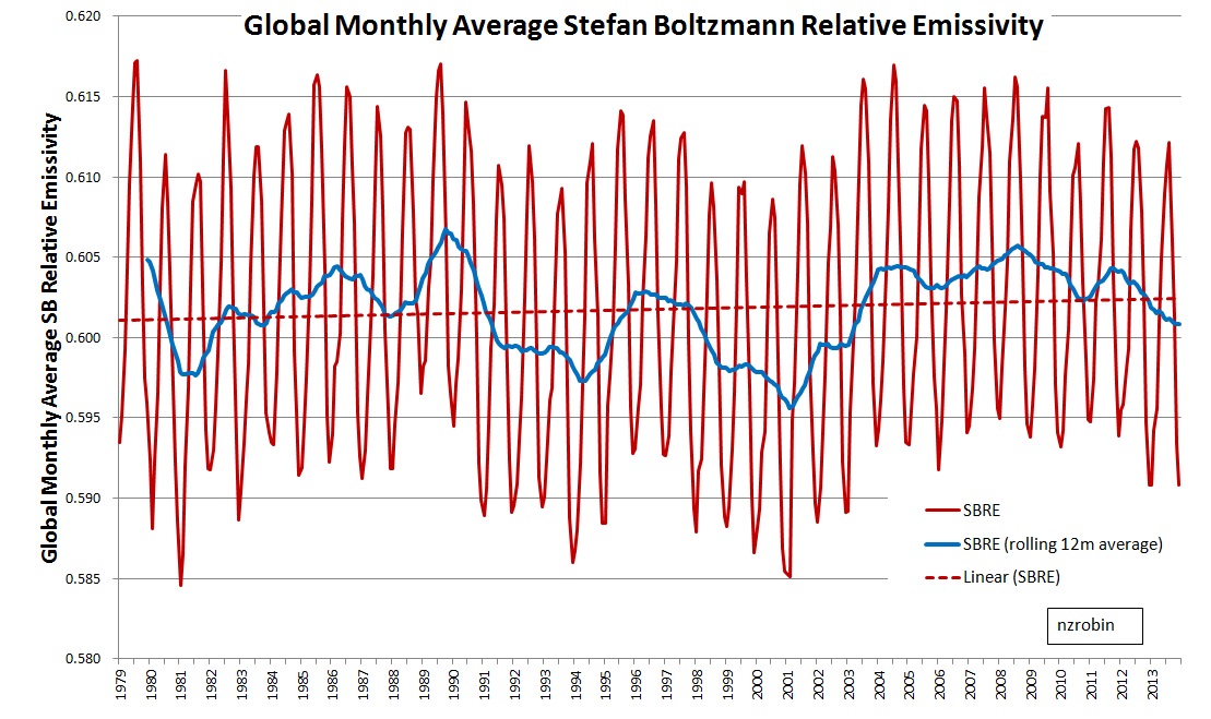
 [New material, monthly derived SBRE calculation to compare with annual average calculation, 4 Nov 14]
Link to Data and Graphs.
https://drive.google.com/folderview?id=0BwCJWmtRR6xeeUxlajM5MXVsVXc&usp=sharing


